This month’s featured SB home showcases a recent Wills Company renovation and offers some serious interior eye candy that has lifted me up and out of my blah house doldrums. Grab a fresh cup of coffee, take a peek and tell me you don’t agree.
I recently caught up with Ridley Wills, company founder and creative design-meister, to ask him about the concept for this project. The Wills Company is a design/build remodeling firm with an impressive reputation. They are known for excellence not only in their award-winning residential designs, but in their white glove project management and client service, as well.
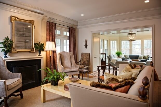
Although not obvious from these interior photos, this home is a row house that was purchased by a Nashville couple ready to downsize. Empty nesters, they wanted to move into town and minimize their footprint, without sacrificing the beautiful furnishings from their larger home. Given the scale of where they had been living, they were faced with some inherent design challenges in order to give the new house, circa late 80′s, a spacious feel that would also accommodate some of the larger furniture they intended to keep. (Look for the dining room table to come – you’ll see what I mean.)
Note: Today’s photographs are courtesy of Wiff Harmer.

AFTER: In this shot, we see the home’s entry, post-remodel. It’s welcoming and inviting and quite a dramatic change from its former existence. The custom-made iron rail is as much a visually pleasing anchor as it is a practical one.

BEFORE: An awkward turn and abrupt stop of the old stairway

In this before shot, looking down a long hallway toward the entry, notice the transom over the doorway. To create the illusion of space, Ridley made a small change that delivered bold results…

AFTER: No transom. As with many things in life, it’s in the small details where the biggest gains are realized. Amazing how removing a small section of wood can make such a tremendous visual difference.

BEFORE: The living room

AFTER: Here’s that same living room, now updated with fresh paint and decorated with the owners’ beautiful upholstered pieces. More importantly, look just beyond the living room. The room you see in the background is where the most stunning changes took place in this project.

BEFORE: Here’s what was the screened-in porch. Ridley said it was added on to the original house, and that in addition to always being either the hottest or the coldest room (from insufficient insulation), it also felt disconnected from the rest of the house. The solution? Widen the entry to the room, add a cased opening, real windows and abundant insulation and some interior design magic. See what it looks like new…

AFTER: Ahhhh. Looks like home to me. (Or at least what I’d like mine to be.) I’m told the homeowners practically live out here now. Can’t say I blame them. Take another look at the “before” photo of the living room. Removing the original French doors and widening the entry to this adjoining room make all the difference.

Here’s a close-up shot of some of the screened porch-turned sunroom’s interior.

More inviting after the fact.

BEFORE: Here’s a photo of the dining room before the renovation. Though there was ultimately no change in the footprint of the room, you won’t believe the transformation…

AFTER: Isn’t it marvelous? Bookcases were added around the perimeter of the room to house the couple’s extensive collection, and the muted putty color of the walls and drapes creates the perfect backdrop for their large pedestal table. Part library, part dining room, this space is a prime example of how downsizing can be accomplished with great success. (And the table, as I mentioned earlier, is just as at home in its new environs as it was before.)

Artwork interspersed among the books adds a welcome visual contrast and is a great way to display “smalls.”

Another view of the dining room before.

And the dramatically different new version.

BEFORE: The kitchen

AFTER: With the exception of changing one wall to accommodate a new refrigerator, the only material changes in the kitchen were appliances, paint and a re-working of the island. Paint makes such a big difference!

Why, yes. I’d love to have a glass of wine!
Aside from the smart design elements, the understated neutral palette carried throughout the home gives a feeling of continuity. The rooms seem to flow from one to the next, without any jarring effect. While this is due in part to Ridley’s creative design and interior designer Sandra McDonald’s helping hand, both of these professionals attribute the ease and success of this project to the couple’s well-curated collections, as well as the wife’s former career as an interior designer. She had well-defined ideas regarding the direction of this project, consummate great taste and an innate aesthetic that is a gift. She just needed help executing the details to bring her vision to life.
And now, having seen this project from all sides, I can understand why both Ridley and Sandra were so enthusiastic to share these photos and their story–simpatico client relationships such as this take the tedium out of a project and replace it with pure pleasure. No doubt, this is a creative person’s dream!
Sources:
- Renovation design/build: Ridley Wills, Design Director, www.willscompany.com
- Interior design: Sandra McDonald and Austine Fleener of Copp Canale Interiors. To contact for more information, click here for email, or call 615-383-4248.
- Photography: Wiff Harmer, wiffharmer.com
16 Responses to “A House Transformed: Renovation Before and After”


great post!!
Sandra McDonald and Austine Fleenor are magicians. I love the tailored pieces and subtle colors. Books in the dining room – so New York!! Why don’t we do that here?? I’m ready to move in!
Wow–gorgeous! That’s one amazing dining table, also. Wonder if it’s custom, or available anywhere?
So gorgeous!!
Sandra McDonald is a wonderful decorator and as always beautiful photos Wiff!
Thanks!
Great job as usual Sandra and Austine. We are never surprised by your brilliant ideas and sophisticated results.
Beautiful!
Collaboration at it’s finest. No better team than Sandra McDonald, Austine Fleenor and Ridley Wills. And the perfect client too!
So enjoyed this beautiful before/after post!
Did anyone proofread this? Amy’s tone is offensive and downright snobbish. I have enjoyed reading many of your posts over the years, but this will be the last one. I unsubscribe as of today. Nashville is so much more than this “we are better than you” attitude.
I see that someone eventually did realize that the tone of this post was quite snobby. It was too little too late for me……that is the last one I will ever read. Editing hours after publication? Hmmmmm
I apologize that we offended you. We are always learning and growing and while we will feature befores and afters in the future, we will make sure we aren’t as rushed to get the copy together so there is more time to edit with care and thought. Thank you for sharing.
Carolyn,
Yes, we tweaked the post under a few captions as we heard your comments and agreed that our post needed some updating as well. Far from suspicious, it’s because we all agreed. Just like our response to your previous comment, I apologize that we let you down and offended you.
I am a fifth-generation Nashvillian who looks forward to my “StyleBlueprint fix.”. I haven’t lived there for over 20 years so I can’t tell you how much I love staying connected through your posts. I enjoy seeing new Nashville talents featured as well as recognizing a few familiar faces along the way. I proudly forward articles to friends all over the country and pass along the deals to my daughter at Vanderbilt. However, I had a different feeling as I read this morning’s post. I thought the tone of the narrative was unnecessarily derogatory in regards to the “before” shots of the featured home. Please realize that many of your readers have fond memories of the previous owners… As well as their relative who designed and built the house. As a beloved member of the community for many years, I’m sure he himself was not thrilled to have a bathtub with a door. Please be more respectful. I value the work that Ridley is doing in the community, and I agree that his vision is fabulous. I hold his work in the highest regard. In fact, I grew up just a few doors down from him on Warner Place. So, I realize that the changes he made did indeed transform the space. It wasn’t the changes that hurt me. Instead, it was the negative tone of the narrative. I guess if the post had featured a commercial space, it wouldn’t have affected me so. I know the former residents’ children and grandchildren subscribe to your post, and it makes me sad to think of them starting their day with visions of the loving HOME that you see as a house…an “awkward, builder-grade, time-worn, dull, disconnected, dismal, old-lady” house. Mary Irwin Walsh
Mary,
I apologize that we offended you. We are always learning and growing and while we will feature befores and afters in the future, we will make sure we aren’t as rushed to get the copy together so there is more time to edit with care and thought. Thank you for sharing.
Hi, Mary, and thanks so much for your comments. I echo what Liza said, that we are learning everyday about how to do things better. Though we try our best to get it right, sometimes we make mistakes, as was the case today, and we apologize sincerely for letting you down.
We value our readers’ feedback always, but most especially when it helps us do our jobs better.
Thank you, again.
Amy